Novedades Next Generation 15-12-2022

#darseBaja a {color:#82b818;}
p{
margin:10px 0;
padding:0;
}
table{
border-collapse:collapse;
}
h1,h2,h3,h4,h5,h6{
display:block;
margin:0;
padding:0;
}
img,a img{
border:0;
height:auto;
outline:none;
text-decoration:none;
}
body,#bodyTable,#bodyCell{
height:100%;
margin:0;
padding:0;
width:100%;
}
.mcnPreviewText{
display:none !important;
}
#outlook a{
padding:0;
}
img{
-ms-interpolation-mode:bicubic;
}
table{
mso-table-lspace:0pt;
mso-table-rspace:0pt;
}
.ReadMsgBody{
width:100%;
}
.ExternalClass{
width:100%;
}
p,a,li,td,blockquote{
mso-line-height-rule:exactly;
}
a[href^=tel],a[href^=sms]{
color:inherit;
cursor:default;
text-decoration:none;
}
p,a,li,td,body,table,blockquote{
-ms-text-size-adjust:100%;
-webkit-text-size-adjust:100%;
}
.ExternalClass,.ExternalClass p,.ExternalClass td,.ExternalClass div,.ExternalClass span,.ExternalClass font{
line-height:100%;
}
a[x-apple-data-detectors]{
color:inherit !important;
text-decoration:none !important;
font-size:inherit !important;
font-family:inherit !important;
font-weight:inherit !important;
line-height:inherit !important;
}
.templateContainer{
max-width:600px !important;
}
a.mcnButton{
display:block;
}
.mcnImage,.mcnRetinaImage{
vertical-align:bottom;
}
.mcnTextContent{
word-break:break-word;
}
.mcnTextContent img{
height:auto !important;
}
.mcnDividerBlock{
table-layout:fixed !important;
}
/*
@tab Page
@section Heading 1
@style heading 1
*/
h1{
/*@editable*/color:#222222;
/*@editable*/font-family:Helvetica;
/*@editable*/font-size:40px;
/*@editable*/font-style:normal;
/*@editable*/font-weight:bold;
/*@editable*/line-height:150%;
/*@editable*/letter-spacing:normal;
/*@editable*/text-align:center;
}
/*
@tab Page
@section Heading 2
@style heading 2
*/
h2{
/*@editable*/color:#222222;
/*@editable*/font-family:Helvetica;
/*@editable*/font-size:34px;
/*@editable*/font-style:normal;
/*@editable*/font-weight:bold;
/*@editable*/line-height:150%;
/*@editable*/letter-spacing:normal;
/*@editable*/text-align:left;
}
/*
@tab Page
@section Heading 3
@style heading 3
*/
h3{
/*@editable*/color:#444444;
/*@editable*/font-family:Helvetica;
/*@editable*/font-size:22px;
/*@editable*/font-style:normal;
/*@editable*/font-weight:bold;
/*@editable*/line-height:150%;
/*@editable*/letter-spacing:normal;
/*@editable*/text-align:left;
}
/*
@tab Page
@section Heading 4
@style heading 4
*/
h4{
/*@editable*/color:#949494;
/*@editable*/font-family:Georgia;
/*@editable*/font-size:20px;
/*@editable*/font-style:italic;
/*@editable*/font-weight:normal;
/*@editable*/line-height:125%;
/*@editable*/letter-spacing:normal;
/*@editable*/text-align:center;
}
/*
@tab Header
@section Header Container Style
*/
#templateHeader{
/*@editable*/background-color:#F7F7F7;
/*@editable*/background-image:none;
/*@editable*/background-repeat:no-repeat;
/*@editable*/background-position:center;
/*@editable*/background-size:cover;
/*@editable*/border-top:0;
/*@editable*/border-bottom:0;
/*@editable*/padding-top:0px;
/*@editable*/padding-bottom:0px;
}
/*
@tab Header
@section Header Interior Style
*/
.headerContainer{
/*@editable*/background-color:transparent;
/*@editable*/background-image:none;
/*@editable*/background-repeat:no-repeat;
/*@editable*/background-position:center;
/*@editable*/background-size:cover;
/*@editable*/border-top:0;
/*@editable*/border-bottom:0;
/*@editable*/padding-top:0;
/*@editable*/padding-bottom:0;
}
/*
@tab Header
@section Header Text
*/
.headerContainer .mcnTextContent,.headerContainer .mcnTextContent p{
/*@editable*/color:#757575;
/*@editable*/font-family:Helvetica;
/*@editable*/font-size:16px;
/*@editable*/line-height:150%;
/*@editable*/text-align:left;
}
/*
@tab Header
@section Header Link
*/
.headerContainer .mcnTextContent a,.headerContainer .mcnTextContent p a{
/*@editable*/color:#007C89;
/*@editable*/font-weight:normal;
/*@editable*/text-decoration:underline;
}
/*
@tab Body
@section Body Container Style
*/
#templateBody{
/*@editable*/background-color:#ffffff;
/*@editable*/background-image:none;
/*@editable*/background-repeat:no-repeat;
/*@editable*/background-position:50% 50%;
/*@editable*/background-size:cover;
/*@editable*/border-top:0;
/*@editable*/border-bottom:0;
/*@editable*/padding-top:0px;
/*@editable*/padding-bottom:0px;
}
/*
@tab Body
@section Body Interior Style
*/
.bodyContainer{
/*@editable*/background-color:transparent;
/*@editable*/background-image:none;
/*@editable*/background-repeat:no-repeat;
/*@editable*/background-position:center;
/*@editable*/background-size:cover;
/*@editable*/border-top:0;
/*@editable*/border-bottom:0;
/*@editable*/padding-top:0;
/*@editable*/padding-bottom:0;
}
/*
@tab Body
@section Body Text
*/
.bodyContainer .mcnTextContent,.bodyContainer .mcnTextContent p{
/*@editable*/color:#757575;
/*@editable*/font-family:Helvetica;
/*@editable*/font-size:16px;
/*@editable*/line-height:150%;
/*@editable*/text-align:left;
}
/*
@tab Body
@section Body Link
*/
.bodyContainer .mcnTextContent a,.bodyContainer .mcnTextContent p a{
/*@editable*/color:#007C89;
/*@editable*/font-weight:normal;
/*@editable*/text-decoration:underline;
}
/*
@tab Footer
@section Footer Style
*/
#templateFooter{
/*@editable*/background-color:#ffffff;
/*@editable*/background-image:none;
/*@editable*/background-repeat:no-repeat;
/*@editable*/background-position:center;
/*@editable*/background-size:cover;
/*@editable*/border-top:0;
/*@editable*/border-bottom:0;
/*@editable*/padding-top:0px;
/*@editable*/padding-bottom:0px;
}
/*
@tab Footer
@section Footer Interior Style
*/
.footerContainer{
/*@editable*/background-color:transparent;
/*@editable*/background-image:none;
/*@editable*/background-repeat:no-repeat;
/*@editable*/background-position:center;
/*@editable*/background-size:cover;
/*@editable*/border-top:0;
/*@editable*/border-bottom:0;
/*@editable*/padding-top:0;
/*@editable*/padding-bottom:0;
}
/*
@tab Footer
@section Footer Text
*/
.footerContainer .mcnTextContent,.footerContainer .mcnTextContent p{
/*@editable*/color:#FFFFFF;
/*@editable*/font-family:Helvetica;
/*@editable*/font-size:12px;
/*@editable*/line-height:150%;
/*@editable*/text-align:center;
}
/*
@tab Footer
@section Footer Link
*/
.footerContainer .mcnTextContent a,.footerContainer .mcnTextContent p a{
/*@editable*/color:#FFFFFF;
/*@editable*/font-weight:normal;
/*@editable*/text-decoration:underline;
}
@media only screen and (min-width:768px){
.templateContainer{
width:600px !important;
}
} @media only screen and (max-width: 480px){
body,table,td,p,a,li,blockquote{
-webkit-text-size-adjust:none !important;
}
} @media only screen and (max-width: 480px){
body{
width:100% !important;
min-width:100% !important;
}
} @media only screen and (max-width: 480px){
.mcnRetinaImage{
max-width:100% !important;
}
} @media only screen and (max-width: 480px){
.mcnImage{
width:100% !important;
}
} @media only screen and (max-width: 480px){
.mcnCartContainer,.mcnCaptionTopContent,.mcnRecContentContainer,.mcnCaptionBottomContent,.mcnTextContentContainer,.mcnBoxedTextContentContainer,.mcnImageGroupContentContainer,.mcnCaptionLeftTextContentContainer,.mcnCaptionRightTextContentContainer,.mcnCaptionLeftImageContentContainer,.mcnCaptionRightImageContentContainer,.mcnImageCardLeftTextContentContainer,.mcnImageCardRightTextContentContainer,.mcnImageCardLeftImageContentContainer,.mcnImageCardRightImageContentContainer{
max-width:100% !important;
width:100% !important;
}
} @media only screen and (max-width: 480px){
.mcnBoxedTextContentContainer{
min-width:100% !important;
}
} @media only screen and (max-width: 480px){
.mcnImageGroupContent{
padding:9px !important;
}
} @media only screen and (max-width: 480px){
.mcnCaptionLeftContentOuter .mcnTextContent,.mcnCaptionRightContentOuter .mcnTextContent{
padding-top:9px !important;
}
} @media only screen and (max-width: 480px){
.mcnImageCardTopImageContent,.mcnCaptionBottomContent:last-child .mcnCaptionBottomImageContent,.mcnCaptionBlockInner .mcnCaptionTopContent:last-child .mcnTextContent{
padding-top:18px !important;
}
} @media only screen and (max-width: 480px){
.mcnImageCardBottomImageContent{
padding-bottom:9px !important;
}
} @media only screen and (max-width: 480px){
.mcnImageGroupBlockInner{
padding-top:0 !important;
padding-bottom:0 !important;
}
} @media only screen and (max-width: 480px){
.mcnImageGroupBlockOuter{
padding-top:9px !important;
padding-bottom:9px !important;
}
} @media only screen and (max-width: 480px){
.mcnTextContent,.mcnBoxedTextContentColumn{
padding-right:18px !important;
padding-left:18px !important;
}
} @media only screen and (max-width: 480px){
.mcnImageCardLeftImageContent,.mcnImageCardRightImageContent{
padding-right:18px !important;
padding-bottom:0 !important;
padding-left:18px !important;
}
} @media only screen and (max-width: 480px){
.mcpreview-image-uploader{
display:none !important;
width:100% !important;
}
} @media only screen and (max-width: 480px){
/*
@tab Mobile Styles
@section Heading 1
@tip Make the first-level headings larger in size for better readability on small screens.
*/
h1{
/*@editable*/font-size:30px !important;
/*@editable*/line-height:125% !important;
}
} @media only screen and (max-width: 480px){
/*
@tab Mobile Styles
@section Heading 2
@tip Make the second-level headings larger in size for better readability on small screens.
*/
h2{
/*@editable*/font-size:26px !important;
/*@editable*/line-height:125% !important;
}
} @media only screen and (max-width: 480px){
/*
@tab Mobile Styles
@section Heading 3
@tip Make the third-level headings larger in size for better readability on small screens.
*/
h3{
/*@editable*/font-size:20px !important;
/*@editable*/line-height:150% !important;
}
} @media only screen and (max-width: 480px){
/*
@tab Mobile Styles
@section Heading 4
@tip Make the fourth-level headings larger in size for better readability on small screens.
*/
h4{
/*@editable*/font-size:18px !important;
/*@editable*/line-height:150% !important;
}
} @media only screen and (max-width: 480px){
/*
@tab Mobile Styles
@section Boxed Text
@tip Make the boxed text larger in size for better readability on small screens. We recommend a font size of at least 16px.
*/
.mcnBoxedTextContentContainer .mcnTextContent,.mcnBoxedTextContentContainer .mcnTextContent p{
/*@editable*/font-size:14px !important;
/*@editable*/line-height:150% !important;
}
} @media only screen and (max-width: 480px){
/*
@tab Mobile Styles
@section Header Text
@tip Make the header text larger in size for better readability on small screens.
*/
.headerContainer .mcnTextContent,.headerContainer .mcnTextContent p{
/*@editable*/font-size:16px !important;
/*@editable*/line-height:150% !important;
}
} @media only screen and (max-width: 480px){
/*
@tab Mobile Styles
@section Body Text
@tip Make the body text larger in size for better readability on small screens. We recommend a font size of at least 16px.
*/
.bodyContainer .mcnTextContent,.bodyContainer .mcnTextContent p{
/*@editable*/font-size:16px !important;
/*@editable*/line-height:150% !important;
}
} @media only screen and (max-width: 480px){
/*
@tab Mobile Styles
@section Footer Text
@tip Make the footer content text larger in size for better readability on small screens.
*/
.footerContainer .mcnTextContent,.footerContainer .mcnTextContent p{
/*@editable*/font-size:14px !important;
/*@editable*/line-height:150% !important;
}
}
.mcnImageContent a {text-decoration:none; color:#222222;}
<!–
Otras noticias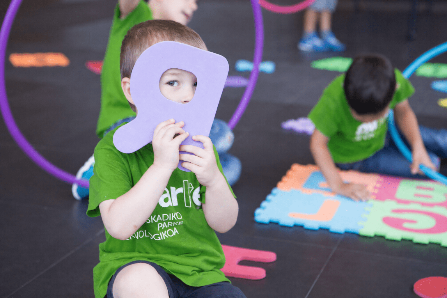 Udalekuak en el Campus Vitoria-Gasteiz: conciliación, sostenibilidad y tecnología para el veranoSaber más sobreUdalekuak en el Campus Vitoria-Gasteiz: conciliación, sostenibilidad y tecnología para el verano VIVEbiotech y Zelluna se asocian para impulsar una terapia celular TCR NK alogénica “off the shelf” mediante vectores lentivirales GMPSaber más sobreVIVEbiotech y Zelluna se asocian para impulsar una terapia celular TCR NK alogénica “off the shelf” mediante vectores lentivirales GMP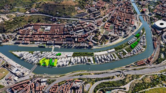 El Campus Tecnológico de Bilbao en Zorrotzaurre se amplía con el proyecto de servicios digitales avanzados para la industria de LantekSaber más sobreEl Campus Tecnológico de Bilbao en Zorrotzaurre se amplía con el proyecto de servicios digitales avanzados para la industria de Lantek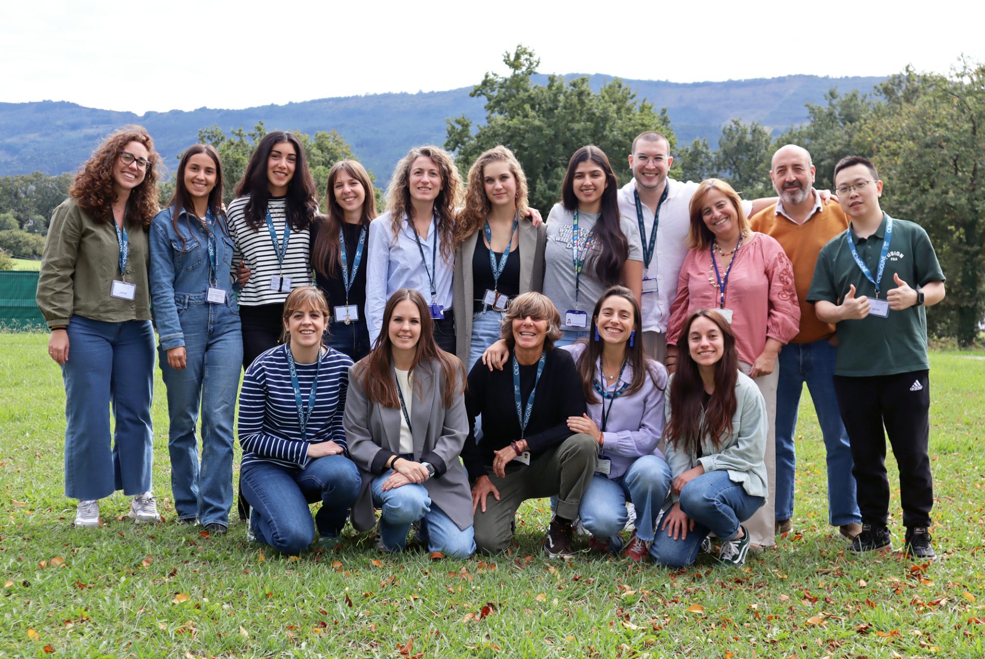 CIC bioGUNE coordina el proyecto LIVER-MOON sobre los efectos del trabajo nocturno en la salud metabólica y cerebralSaber más sobreCIC bioGUNE coordina el proyecto LIVER-MOON sobre los efectos del trabajo nocturno en la salud metabólica y cerebral ¡Si lo tuyo es la música y quieres pasar un buen rato, no te pierdas una nueva edición del PARKEA MUSIK FEST!Saber más sobre¡Si lo tuyo es la música y quieres pasar un buen rato, no te pierdas una nueva edición del PARKEA MUSIK FEST! |


